*Spec Email work for the new Back to Business collection for KINSHP*
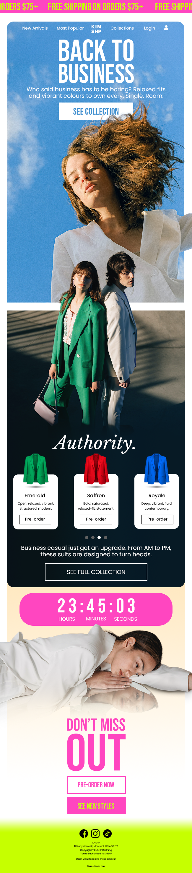
Back to Business
This approach focuses on a clean, editorial layout designed to be highly readable and UX-friendly. Multiple CTAs and product cards help guide engagement while emphasizing modern tailoring and everyday wearability.
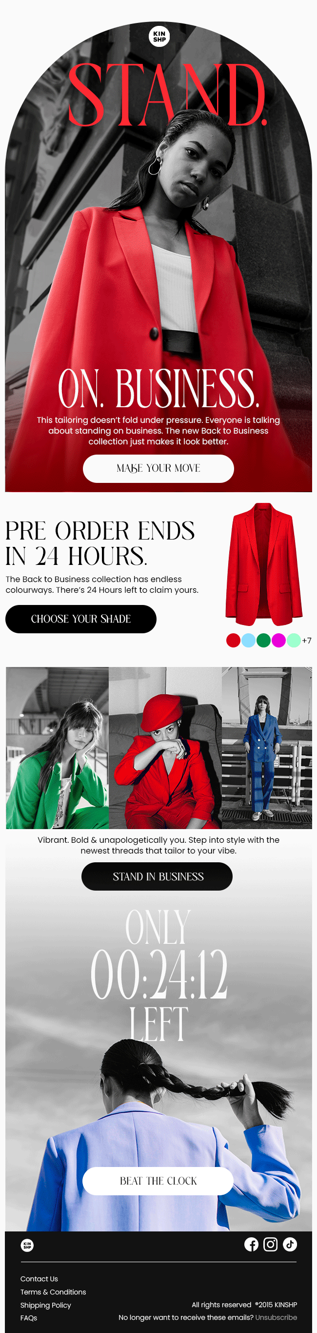
Stand. On. Business.
This concept leans into power and confidence. A low camera angle positions the model in a way that the viewer is metaphorically looking up to the model in the suit, visually reinforcing the headline. The vibrant suit colours act as the primary visual hook, while the copy reflects a modern tone inspired by contemporary culture and social media language.
This concept leans into power and confidence. A low camera angle positions the model in a way that the viewer is metaphorically looking up to the model in the suit, visually reinforcing the headline. The vibrant suit colours act as the primary visual hook, while the copy reflects a modern tone inspired by contemporary culture and social media language.
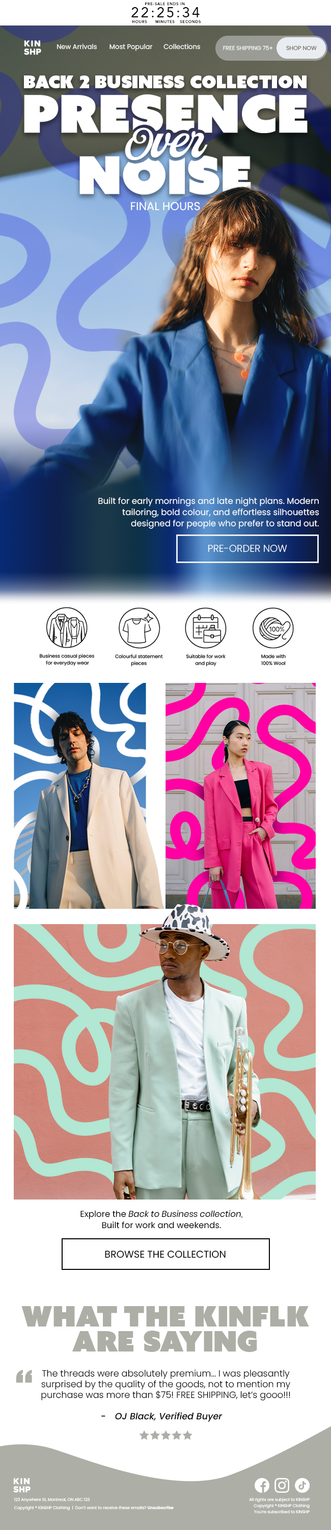
Presence Over Noise
This direction introduces abstract “noise” graphics that symbolize the chaos of everyday life. Each graphic matches the colour of the suit it surrounds. The diverse models cut through that visual noise with bold colour and confident tailoring, reinforcing the campaign headline.
This direction introduces abstract “noise” graphics that symbolize the chaos of everyday life. Each graphic matches the colour of the suit it surrounds. The diverse models cut through that visual noise with bold colour and confident tailoring, reinforcing the campaign headline.